
Design is one of the most important details that you need to pay attention to.
Even Derek Halpern says that it's more important than content nowadays.
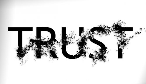
As soon as your readers visit your blog, before they even read your content, they will either trust or distrust you based on your web design. There are a lot of design mistakes out there and you need to avoid them and learn how to make your readers trust you even before they start reading your content.

To do this, you'll want to learn how to create a great design that hooks people immediately.
In this post, you'll learn how to avoid those design blunders and focus on the key areas that can make people trust you and won't turn them off.
So let's dive in.
1- Cluttered Web Design:
When people stumble on a cluttered looking webpage, they go crazy. They get overwhelmed.
By “clutter,” I mean social media badges, ads, and the like.
It turns people off, all the time.
So go over to your blog's sidebar, and remove all unnecessary widgets there.
3-4 is enough. Maybe it's more than enough.
All you need is a subscribe box, a “Popular Posts” widget, a way to share some of your resources, and maybe an “About the Author” box. You don't need more than that.
So that's the first point here: Eliminate Clutter from your design. Make everything simple and minimal.
2- Still using 12-point font instead of 14:
As Derek Halpern says, “Size 14 is the new size 12.”
Many people distrust a website because fonts are too small. It seems ridiculous that this affects the design. I also thought this at the beginning but later on, I learned why.
The reason why many people may distrust your website is that when they're looking for new information, they don't know if what you're telling them is true or not. So they resort to things they're more comfortable with, like font size and web design.
If you're using a 12-point font size, change that to 14-point. You don't want to turn people off before they even read your content.
Sometimes designers say that smaller is cooler, but this only makes people distrust you.
Remember: the main reason why you're putting a lot of effort into your design is not just to look cool. You want to convert visitors into subscribers and eventually customers.
3- Having a long line length above the fold:
People prefer shorter line lengths over longer lines. They think they can read the shorter line faster.
So if you have a line that is 360 pixels long, people believe they will read that faster than a 600-pixel line.
They think so, but it's not actually not true on the internet. Even so, when visitors stumble on your site design with big long lines, they get turned off.
Here's a simple trick to solve this design problem.
You can have an image that takes up half of your content column above the fold, and then place your text to the left of the image so it seems to your readers that it's a short line length.
You need to do that for the first few sentences because if people read those sentences, chances are they're going to read your entire article.
CopyBlogger does this well.
So, you need to remove the barriers to reading those first few sentences in your post, and one of those ways is to limit the line length by including an image that takes up about half of your content column. Simple tip but it can help you improve conversions and make people trust you.
4- Slow speed because of your design:
Amazon did some research and found out that for every one-tenth of a second they increase their load time, their sales dropped by one percent.
I'm not a tech guy. However, there is an easy way to speed up your site. You just need to get a plugin called W3 Total Cache. It's free and you can install it on your WordPress blog.
It's that simple.
You can also set up a content delivery network (CDN), which integrates easily into W3 Total Cache.
A CDN's function is to take your images and any other files that can slow down your server and to load them via the CDN itself, instead of your own server.
That way, the CDN delivers content on your site at a fraction of the bandwidth, and it looks like you load really fast.
There are CDNS out there, such MaxCDN and NetDNA. For most people, it will cost $40/year. It all depends on your traffic. But it's not that much.
If you want to learn more about how to increase your blog speed, check out these 2 posts.
- Supercharge WordPress: A Little Known Way to Increase Pageviews and Conversions
- How I Grew Quick Sprout From 121,311 to 244,923 Readers in 30 Days
BONUS: Poor navigation:
The last key that turns people off on your blog is poor navigation. If people can't find out what they want, obviously they will leave your site.
So if they stumbled upon one of your posts and they don't want it, make it easy for them to go to the homepage, or to the About page.
Don't piss them off. Create the navigation that can help them check more of your content. This can really make a difference between a great and bad design.
Watch this video by Lisa Irby of 2 Create a Website called:
Improve Your Earnings & Traffic With a Better Navigation
Last Words:
Design isn't all about the look. It can be a tool that you can use to make people trust you. It's what people see before they read your content. Even if your content is epic and can't be found anywhere else, if your design is horrible then people won't even look at it.
So now you have the key areas of design that turn people off.
Take Action.
Go and fix them. It's easier than you think.
Let's hear from you, how have you improved the design of your blog?